Introduction

Color significantly impacts how we perceive the world around us, both in physical and digital spaces. This is particularly true in design and printing, where accurate and consistent color is essential. For this reason, contrast color checkers play a critical role. They serve as a benchmark, ensuring colors appear as intended across various mediums. This post will explain the significance of contrast color checkers and their role in visual integrity and accessibility.
Color consistency is fundamental for a successful design. Imagine creating a website with a carefully chosen color palette, only to discover the printed version appears dull and distorted. Similarly, a logo’s impact can be diminished if the color shifts during production. These situations highlight the need for consistent color, which directly affects brand identity, user experience, and the effectiveness of visual communication. Contrast color checkers address this challenge by creating a common color language for designers, printers, and everyone involved in the process.
Furthermore, contrast goes beyond aesthetics and is essential for accessibility. For people with visual impairments, sufficient contrast between foreground and background elements is crucial for readability and usability. A contrast color checker is a vital tool for meeting accessibility guidelines, such as the Web Content Accessibility Guidelines (WCAG), ensuring digital content is inclusive for everyone. This means designers can create visually appealing designs that are also usable by a wider audience. Proper contrast also enhances the user experience by improving readability and visual clarity for all users.
This introduction lays the groundwork for understanding the importance of contrast color checkers. In the following sections, we’ll explore what a contrast color checker is, the different types available, and how to use them effectively. This information will equip you to create impactful and accessible designs.
What is a Contrast Color Checker?

Continuing our discussion on contrast, let’s look at the technical aspects of a contrast color checker. It’s essentially a tool for evaluating the difference in perceived brightness between two colors, typically foreground text and its background. This difference, expressed as a ratio, determines the readability and accessibility of content, particularly for visually impaired users. Think of it as a measuring tool for visual clarity. Just as a ruler measures length, a contrast color checker quantifies the difference between colors, ensuring content is easily discernible.
Most contrast color checkers use algorithms based on standards like WCAG. These algorithms take the RGB (red, green, blue) values of the two colors and calculate the contrast ratio. The ratio is expressed as X:1, where higher values signify greater contrast. For example, 7:1 shows a substantial difference in brightness, while 1:1 means no contrast, essentially identical colors. This numerical representation allows designers to assess and adjust color combinations precisely.
Many contrast color checkers offer more than just ratio calculation. Some integrate directly into design software or browsers, providing real-time feedback as colors are selected. Others simulate different types of color blindness, letting designers experience their work from the perspective of visually impaired users. These features empower designers to create inclusive and accessible content.
WCAG guidelines are central to the function of most contrast color checkers. WCAG specifies contrast ratio requirements for different text sizes and weights. For instance, standard text needs a minimum ratio of 4.5:1 for AA compliance (the generally accepted level of accessibility). Larger text needs a 3:1 ratio. These standards offer a framework for designers, helping them meet accessibility benchmarks. Meeting WCAG guidelines, however, is just a starting point. While compliance indicates a level of accessibility, true inclusivity requires considering the diverse needs of all users.
While WCAG remains the dominant standard, contrast analysis continues to evolve. New algorithms like the Accessible Perceptual Contrast Algorithm (APCA) are being developed to address WCAG’s limitations. These new algorithms aim for a more nuanced and perceptually accurate measure of contrast, potentially improving visual accessibility. Contrast color checkers are not static tools but constantly refined to better reflect human perception of color and contrast. This ongoing development provides designers with the most effective tools for creating truly inclusive digital experiences. The emergence of tools with advanced features like color blindness simulation and real-time feedback further enhances the role of contrast color checkers in the design process. These advancements highlight the increasing importance of incorporating accessibility from the project’s start.
Types of Color Checkers
Building on our discussion, let’s explore the different types of contrast color checkers available. While they all aim to evaluate color contrast, they come in various formats and offer a range of functions. Selecting the right tool depends on individual needs, preferences, and project requirements. Much like choosing the right tool for a job—a hammer for nails, a screwdriver for screws—different checkers are better suited for different tasks.
Web-based contrast color checkers are the most accessible. These free tools require no downloads or installations. Users simply input foreground and background colors, often via hex codes or RGB values, and the tool calculates the ratio. A simple online search will yield numerous options. This ease of access makes them ideal for quick checks. Many web-based checkers are integrated into larger web accessibility platforms, providing a suite of tools for evaluating website accessibility.
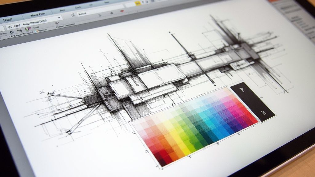
For a more integrated approach, contrast color checkers are also available as browser extensions or design software plugins. These tools offer real-time feedback within the design environment, eliminating the need to switch between applications. This “live” feedback speeds up the design process and reduces later revisions. Some extensions even highlight low-contrast elements directly on a webpage, simplifying identification and correction. Many offer additional features like color blindness simulations, providing valuable insight into how users with visual impairments perceive your designs.
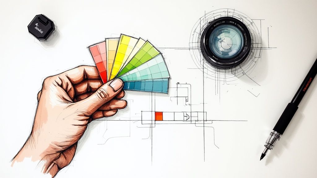
Physical contrast color checkers, though less common than digital tools, still have their place. Typically a printed card or chart with various color combinations, they represent different contrast ratios. These physical tools are often used in print design, where precise color reproduction is critical, serving as a tangible reference point. It’s important to note, though, that physical checkers can be affected by ambient lighting and printing processes. While helpful for general assessment, digital checkers offer more precision. Physical checkers can also be useful for educating clients and stakeholders about contrast and accessibility.
Beyond basic ratio calculation, some tools offer more sophisticated analysis. These advanced checkers might use newer algorithms like APCA, which provides a more perceptually accurate measure of contrast. They may also offer detailed reports, including WCAG compliance levels and recommendations for improvement. For professionals working on complex projects, these tools are invaluable for ensuring the highest level of accessibility and usability. The field of contrast analysis is constantly evolving, and new tools and techniques are always emerging. By staying informed, designers can use the latest technology to create inclusive and accessible designs.
How to Use a Color Checker

Knowing how to use a contrast color checker effectively is as crucial as understanding the different types available. Like any tool, correct usage leads to the best results. Mastering its use is essential for creating designs that are both visually engaging and accessible. The process, while simple in theory, varies slightly depending on the tool. Let’s explore the general workflow and best practices for different scenarios.
Most digital contrast color checkers operate on a simple input-output principle. You enter the foreground and background colors (using hex codes, RGB values, or a color picker), and the checker provides the contrast ratio. This simple process is quick and efficient. The checker calculates the ratio and indicates whether it passes WCAG requirements, giving designers immediate feedback. However, understanding the implications of that ratio is just as important as knowing the number itself.
Web-based checkers excel at quick assessments. They often provide instant feedback on WCAG compliance, indicating whether the ratio meets minimum requirements for various text sizes. For example, when checking regular-sized text, the checker will tell you if the ratio is at least 4.5:1 (WCAG AA level). This quick feedback is invaluable during early design stages. Many also allow experimentation with color combinations to find a suitable contrast ratio, balancing aesthetics and accessibility.
Contrast checker extensions and plugins offer a more streamlined workflow. Integrated into your design environment, they provide real-time feedback as you work. This eliminates the need to switch between applications. For instance, a plugin in Figma or Sketch can display the contrast ratio directly in the interface as you change colors. This live preview speeds up the process and ensures accessibility considerations are addressed throughout. This prevents contrast issues later, saving time and effort. Many also offer color blindness simulations, helping you visualize how designs appear to individuals with color vision deficiency, thus enhancing empathy and inclusivity.
Physical contrast color checkers are vital in print design, where color accuracy is paramount. They provide a tangible reference for evaluating how colors appear when printed on different materials and under various lighting conditions. Unlike digital checkers, they can account for printing nuances and ink-substrate interactions. This makes them crucial for achieving color fidelity. However, they are less precise than digital tools and can be affected by external factors like ambient light. Using both digital and physical checkers offers a comprehensive evaluation.
Simply checking the contrast ratio is a starting point. For truly accessible designs, consider the following: Context is key—a WCAG-compliant combination might still be difficult to read in bright sunlight or on a low-resolution screen. Utilize color blindness simulations to understand how users with different types of color vision deficiency perceive your design. Avoid conveying information solely through color; use redundant cues like icons and text labels. Finally, iterative testing and refinement with real users, including those with visual impairments, is essential for gathering feedback and making adjustments.
As technology progresses, so will contrast color checkers. Staying current with developments and best practices is crucial for optimal accessibility and user experience. New algorithms like APCA offer a potentially more accurate measure of perceived contrast and might become standard in future tools. By embracing advancements, designers can continuously improve inclusivity. This reinforces the vital role of contrast color checkers in creating a more accessible digital world and emphasizes that accessibility is an ongoing process of refinement.
Digital vs Physical Checkers
Let’s compare the advantages and disadvantages of digital and physical contrast color checkers. Both evaluate contrast, but they cater to different needs and workflows. Understanding their strengths and weaknesses helps you choose the best tool for your project, ensuring designs meet accessibility standards while remaining practical.
Digital checkers offer several advantages. Their precision is unmatched, providing accurate ratios based on numerical color values. This eliminates subjectivity, ensuring consistent results. They can differentiate between minute differences in ratios, crucial for WCAG compliance, which a physical checker might miss. They integrate seamlessly into design workflows, providing real-time feedback and streamlining the process. Many also include advanced features like color blindness simulations, making them powerful tools for accessible designs. However, their accuracy depends on screen calibration, emphasizing the importance of a well-calibrated monitor.
Physical checkers, though less common, are still valuable, especially in print design. They provide a tangible representation of color combinations, allowing designers to assess contrast in real-world conditions, considering the printing process and material. This lets designers see how colors interact with paper and ink. However, they lack the precision of digital tools and can be affected by ambient light. Subtle contrast differences under varying lighting can lead to inconsistent results. This makes them less reliable for precise measurements. They also generally lack advanced features like color blindness simulations, limiting their scope for comprehensive accessibility.
Choosing between digital and physical checkers depends on the project. For digital design, web development, and screen-based projects, digital checkers are generally preferred due to their precision, workflow integration, and advanced features. In print design, where the final output is physical, physical checkers can be useful for evaluating color on the substrate. This doesn’t diminish the importance of digital checkers in print design for accurate initial assessments. Often, a combination of both provides the most comprehensive approach. Just as a chef uses both a digital thermometer and experience, designers can combine the precision of digital checkers with the tangible feedback of physical checkers for optimal results. This ensures that both the digital and physical representations of the design meet accessibility standards.
Applications and Benefits

Building on our previous points, let’s delve into the practical applications and benefits of contrast color checkers across various fields. These tools are more than just for checking compliance; they’re essential for creating effective, inclusive, and aesthetically pleasing designs, both online and in print. Understanding their broad applications is crucial for any designer or developer. This bridges the gap between technical specifications and the real-world impact of contrast on user experience.
A primary application is in web accessibility. For users with visual impairments, sufficient color contrast is crucial for navigating and interacting with websites. Contrast color checkers ensure websites adhere to guidelines like WCAG, making content perceptible to a wider audience. For example, adequate contrast between text and background ensures users with low vision can read comfortably. This directly translates into a more inclusive online experience. Adhering to these guidelines also mitigates legal risks related to accessibility and strengthens brand reputation.
Beyond accessibility, contrast color checkers improve usability and readability for all users. Clear and well-defined contrast reduces eye strain, improves focus, and makes content easier to scan, benefiting even those without visual impairments. A website with optimal contrast between headings, body text, and background allows users to quickly understand the information hierarchy and find content. This enhanced readability improves user experience, encouraging engagement and reducing bounce rates. Consequently, using a contrast color checker is integral to optimizing website performance and user satisfaction.
Brand consistency is vital for building recognition and trust. A contrast color checker maintains consistent brand colors across different mediums. This ensures brand identity remains cohesive, regardless of whether a user interacts with the brand on a website, in print, or on a mobile app. Ensuring consistent logo colors across merchandise, marketing materials, and online platforms reinforces brand recognition and strengthens its image. This attention to detail elevates the brand’s professional image, conveying quality and care.
In print design, a contrast color checker ensures accurate and consistent colors in the final product. This is crucial for materials like brochures, magazines, and packaging, where color conveys information and evokes emotions. A contrast color checker prevents readability issues caused by low contrast, ensuring printed materials are both attractive and accessible. This attention to detail demonstrates professionalism and effectively communicates the intended message.
While meeting accessibility standards is important, the benefits of contrast color checkers go further. Integrating contrast analysis from the project’s start allows designers to make informed color choices, ensuring accessibility and aesthetics. This proactive approach streamlines the design workflow, reducing later revisions. It fosters a culture of inclusivity where accessibility is integral to design philosophy. This leads to more engaging, user-friendly, and aesthetically pleasing experiences for everyone.
For agencies committed to high-quality, accessible websites, HrefPulse offers a comprehensive solution. It monitors and validates various aspects of website performance, including WCAG 2.1 compliance. By incorporating HrefPulse, agencies can confidently deliver projects meeting the highest standards. Explore HrefPulse at https://www.hrefpulse.com/.